

Branding
February, 2023
Founder of SCL, Anna Sarelly, reached out to me with one of her aspirations: Having her own makeup brand.
Due to external motives, we had 1 day to create the identity for her unique makeup dream: Sarelly Creativo Lab.

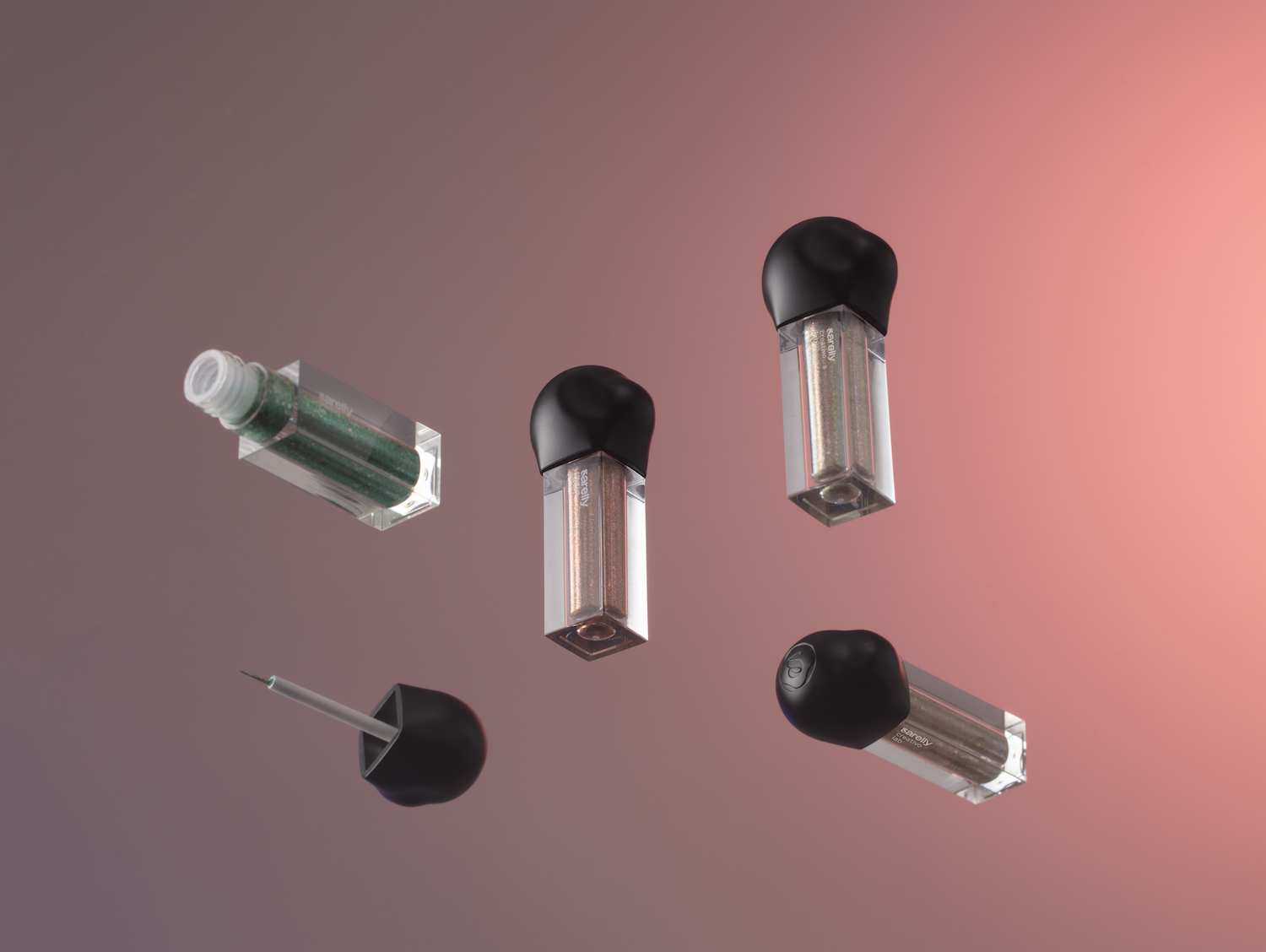
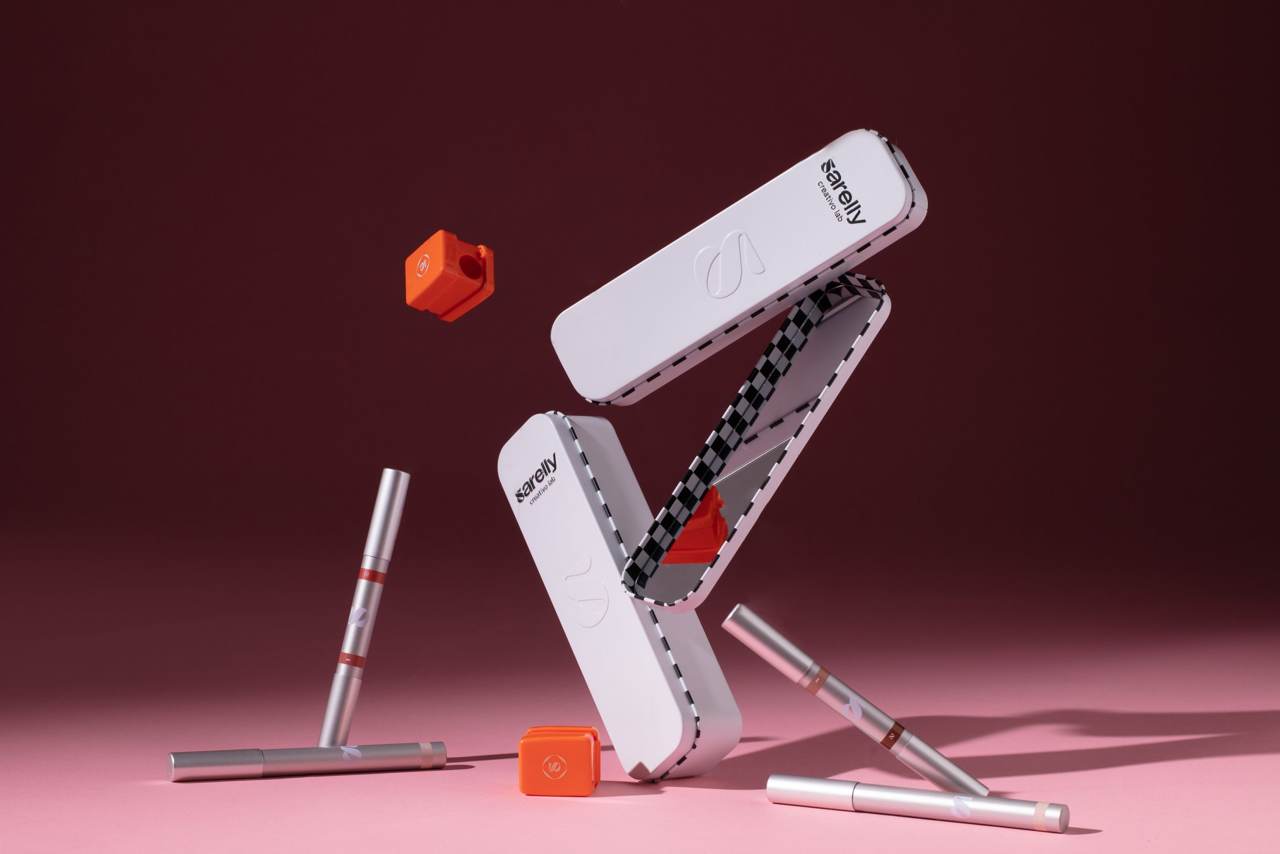
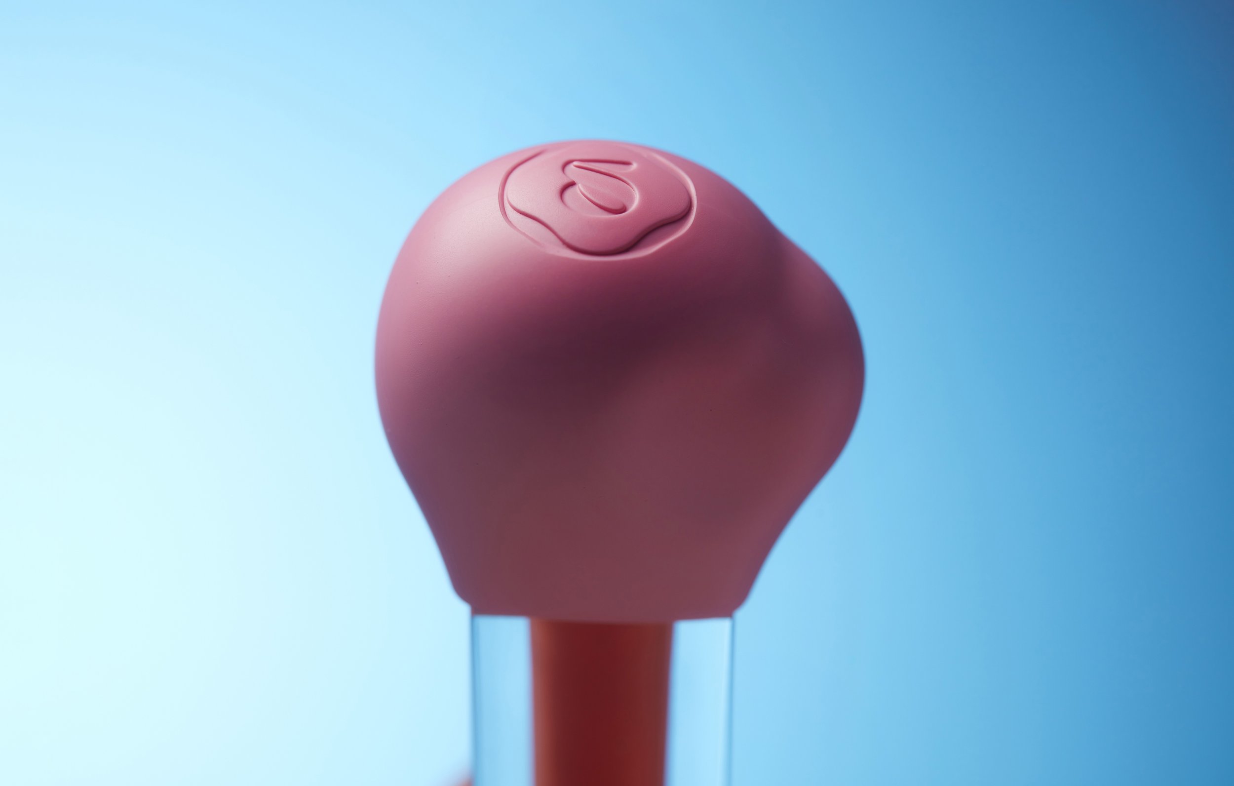
Anna aimed to establish a brand identity that highlighted the uniqueness of both their packaging and their extraordinary formula.
In crafting the brand, I emphasized keywords such as ‘clean,’ ‘fun,’ ‘high-end,’ and ‘transformation’. Ensuring adaptability for future brand evolution.
The complete logo comprises three distinct typographies that harmoniously blend to encapsulate the brand's identity. At its core lies "Buster," which accentuates the letter 's' with its bold, groovy personality, eventually evolving into the brand's standalone monogram. This engaging element is paired with "Nicéphore," a sans-serif font with sharply contrasting joints and concise ascenders/descenders, imparting a refined touch to the dynamic 's'.
Intriguingly, "Gortex" takes the spotlight for the phrase 'creativo lab,' translating to 'creative lab.' This choice of typography resonates strongly with laboratory settings, where experimentation and evolution thrive. Much like a laboratory where humans explore and manipulate formulas, Gortex infuses a geometric sans-serif style with an experimental twist. Notably, upon closer inspection, the deliberate openings in the letters 'r,' 'e,' 'a,' 't', and ‘b’ impart subtle humanistic nuances, mirroring the transformative essence of a laboratory environment. This deliberate attention to detail not only enhances the visual appeal but also conveys depth and innovation within the logo design.


Photographs featured are exclusively owned by Sarelly Creativo Lab.