Packaging Design
February 2024
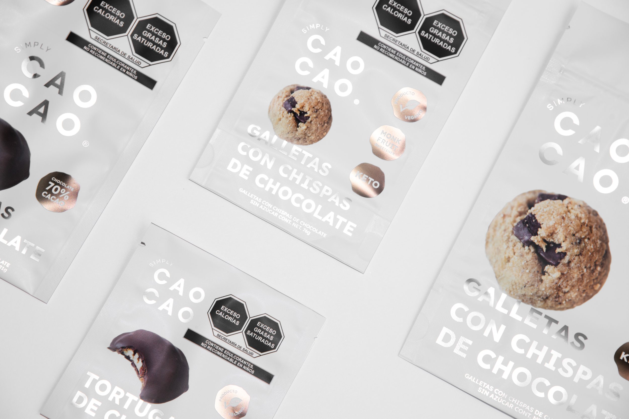
Simply CAOCAO ® is a brand of healthy pastries created by two Mexican nutritionists, with the mission to change the stigma that healthy snacks cannot be delicious and nourishing at the same time.
The original logo design featured two typographies that were preserved to maintain the essence of the brand, requiring only some adjustments. With subtle yet significant changes, a balanced logo was achieved.
Additionally, variations were explored, leading to the primary logo in two tiers, with a particular emphasis on the syllables "CAO," which serve as the focal point of the brand.
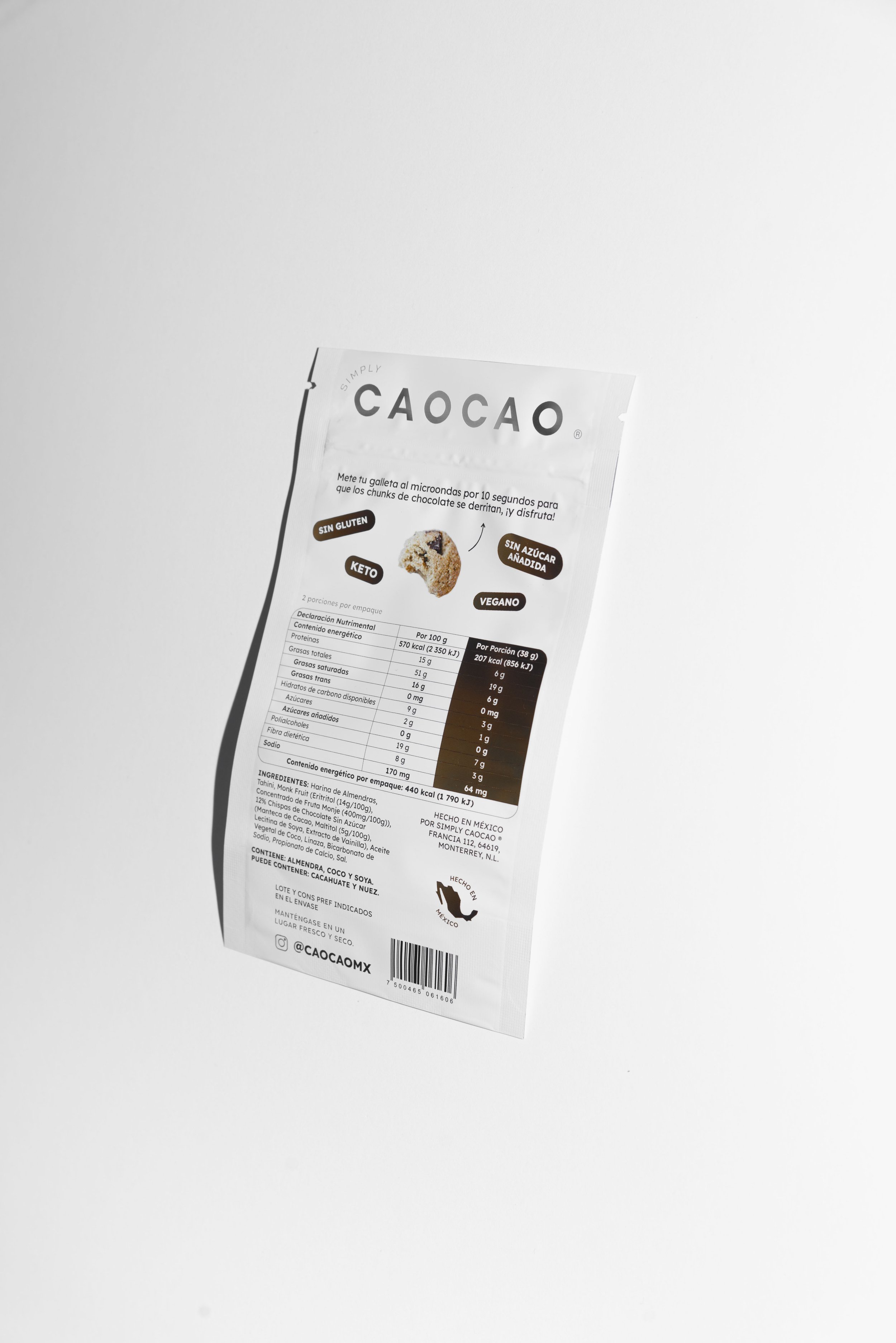
Improving the hierarchy of elements and enhancing legibility and composition, was key to developing the packaging for Simply CAOCAO ®

We wanted to add some vibrant colors to the new packaging, maintaining a fresh and modern aesthetic while adding a fun vibe to make it eye-catching. After trying out different combinations, we went for Silver and Brown Foil. Achieving the perfect balance between a sophisticated, clean look with a cool, and appealing twist.


