Rebranding & Label Design,
January 2023
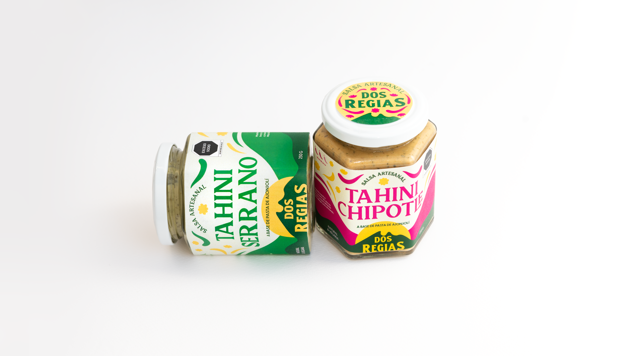
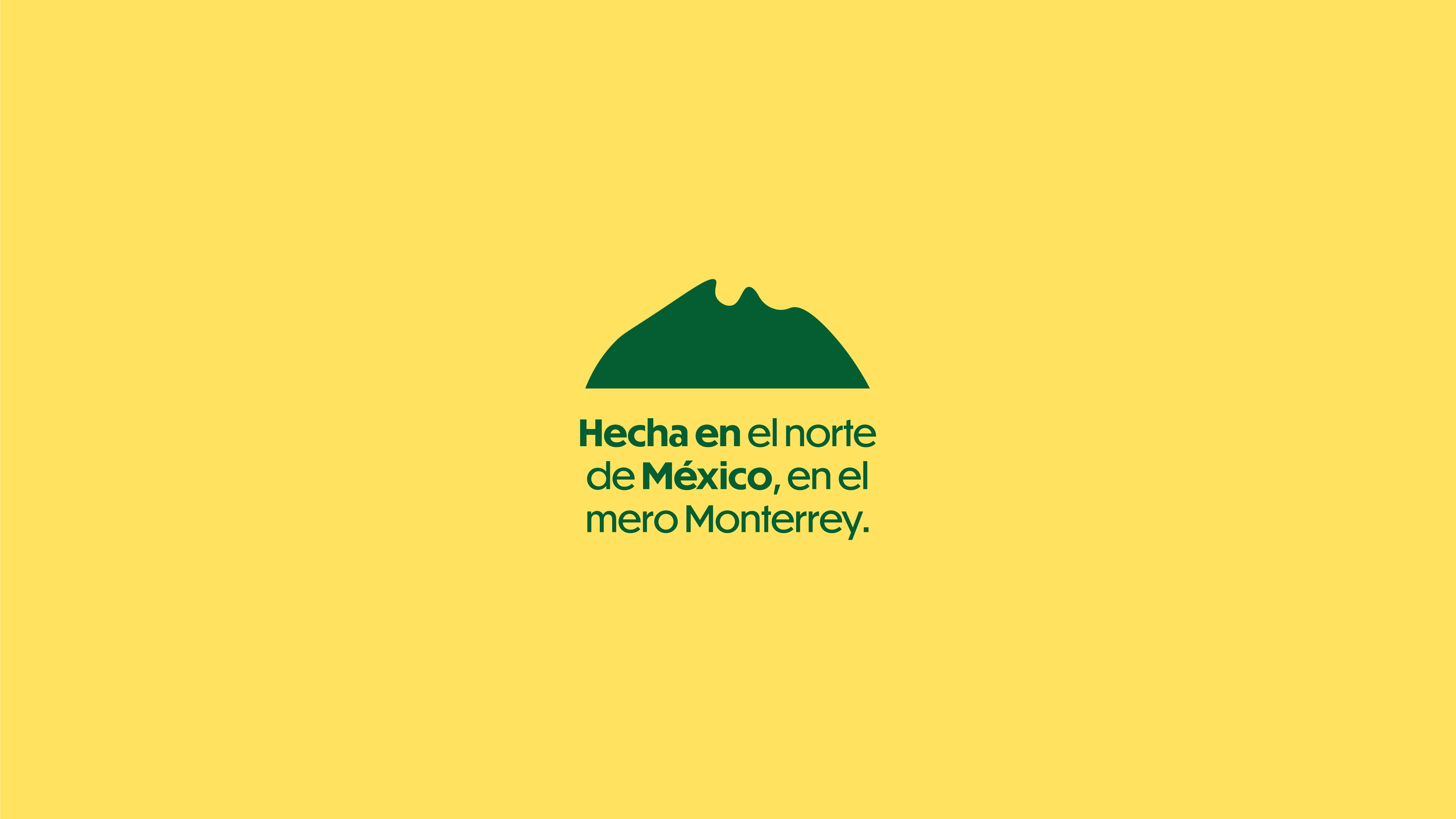
Dos Regias is a Mexican, Regiomontana salsa brand who came to me for a full rebrand. Valeria, the owner, had two specific goals in mind. Firstly, to captivate the attention of potential customers by employing a vibrant and eye-catching Mexican color palette. Secondly, she aimed to communicate the brand's unwavering pride in being 100% Regia, originating from Monterrey, Nuevo Leon, and showcasing this connection to the world.
To create the logo, a Sans-Serif typeface was employed and customized to fit across two levels. In order to emphasize the word "Regias," it was enlarged compared to the other elements. However, there was still a feeling that something was lacking. That's when a deliberate decision was made to set the letter "S" in uppercase, adding hierarchy and suggesting a city nestled within mountains.


While seeking the ideal typeface for this project, I explored classic Mexican fonts known for their bold and decorative qualities. My intention was to capture the joyful traditions of Mexican culture but without incorporating intricate details or handcrafted elements typically associated with such fonts. That's when I came across Sirkle, and I immediately recognized it as the perfect typography for the task. Its combination of sharp and flowing characters, along with its edgy terminals, lends a modern feel that exudes strength and boldness, ensuring a visually striking and attention-grabbing impact. The semi-serif typeface, paired with the vibrant color palette, creates a playful and festive atmosphere infused with whimsical elements and references to the rich and joyful Mexican culture.